Soko Glam Site Navigation Usability Testing
Role: UX Researcher
Team: Abir Ahmed, Yilin Fang, Nina Moyski, Sahaja Pinnu
Timeline: December 2022 (1 week)
Skills: Usability Testing
For this Needs Assessment and Usability Evaluation, our team focused on user testing Soko Glam, a Korean skincare products website.
Our motivation to explore this site came from my lack of ability to understand terminology on skincare websites and my team’s frustrations with shopping sites.
Tools: UserTesting.com, Google Workspace
Objectives and Methods
Assess the difficulty of using pages and shopping features.
Method: Tasks, free responses, and rating scale questions on finding a specific product, as well as adding and removing products from the shopping cart.
Understand how users come to the conclusion on which products they find useful or choose to purchase.
Method: Tasks, free responses, and rating scale questions about building a multi-product skincare routine.
Background
Research Questions
How accessible and easy to use is the mobile page compared to desktop users?
How intuitive is the overall shopping experience on the website?
How do users decide on what product to buy?
Purpose
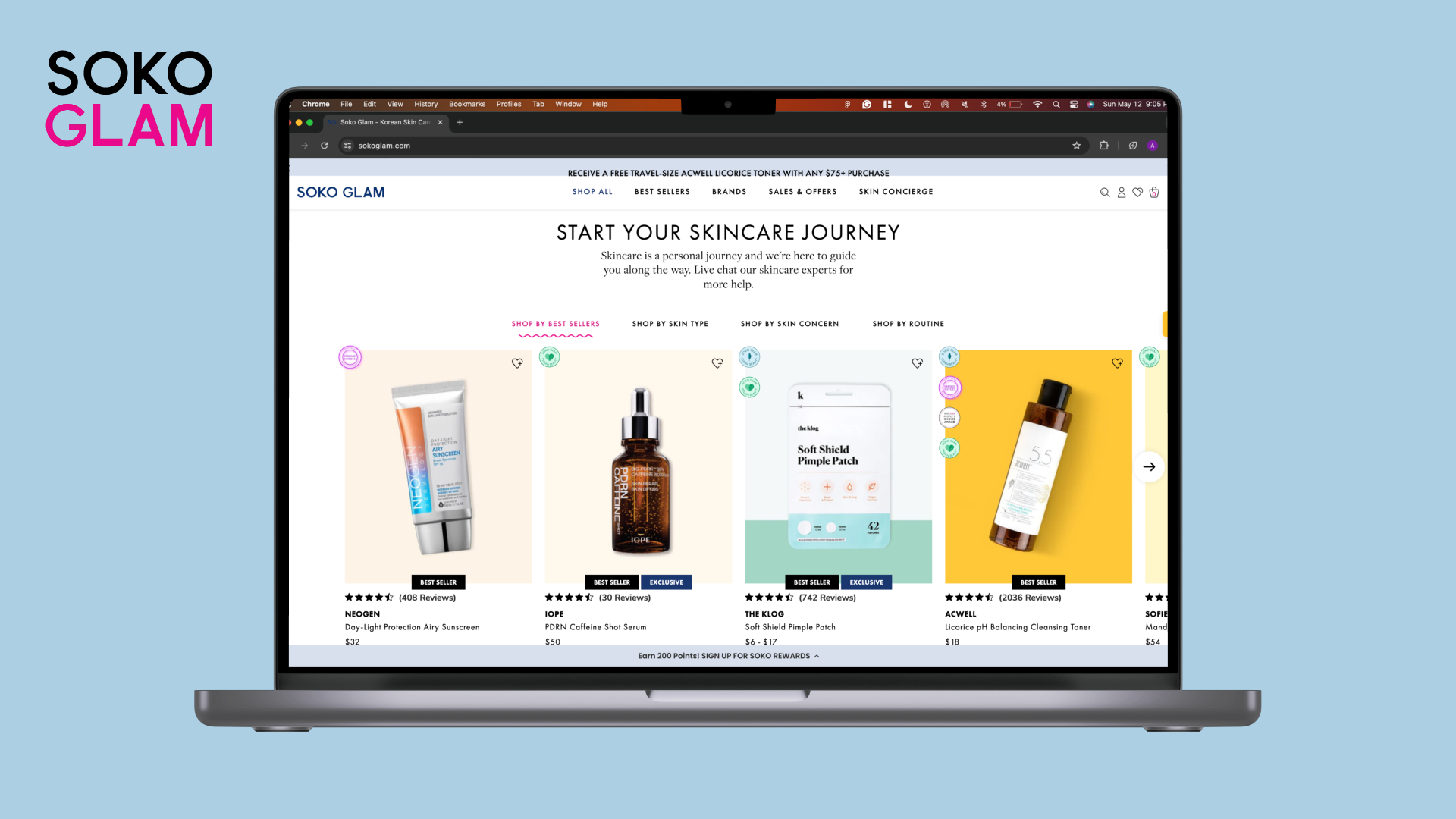
Sokoglam.com is a skincare website with rising popularity as Korean skincare products have become increasingly popular in recent years. The purpose of this study is to find what aspects of the shopping experience on this website are difficult to use, understand the mental model of how users choose to purchase a product, and how can the website be redesigned.
Study Details
Method: Usability tested with 3 users (per UX researcher) from UserTesting.com
Test Details: 4 tasks with difficulty rating and task success responses + 3 free verbal response questions + 3 rating scale questions on satisfaction with tasks and products.
Participant details: p1, p2, p3
Sample Task: Find “Azelaic Topical Acid 10%” by Naturium.
Follow-up Free Response Question: What was the most difficult aspect of finding this product?
Key Finding #1
Users dislike the sparkles and animation on the big tagline image on the homepage.
“Whatever it is, the way you tell your story online can make all the difference.”
“I don’t like the homepage but once I get past the homepage, everything is easy to use.”
“The blue sparkly background with sparkles is distracting, and the text on that image is hard to read.”
3 out of 6…
Desktop users reported that they didn’t like the sparkles that they saw at first on the home page. Below is the current homepage with sparkles and distracting animation removed.

After (Desktop) - Homepage
Key Finding #2
The overall website is easy to use and navigate.
Overall, the website is easy to use. Most desktop users reported the difficulty of all tasks to be either 4 or 5. Only one user reported one task to have a difficulty of 3.
4.67…
Was the average level of difficulty of all tasks.

Desktop - Azelaic Topical Acid 10%
Key Finding #3
Having multiple options in filtering is great in terms of products, categories, etc.
P1: Finds a variety of products useful: masks, pimple patches, airy sunscreens, and cleaners, with plenty of others that intrigue her. The description that pops up when hovering over the product is helpful.
6 out of 9…
Users mentioned how there are a lot of product options and navigation options.
8 out of 9…
Users find at least one product in the bestsellers items useful.
Data Overview
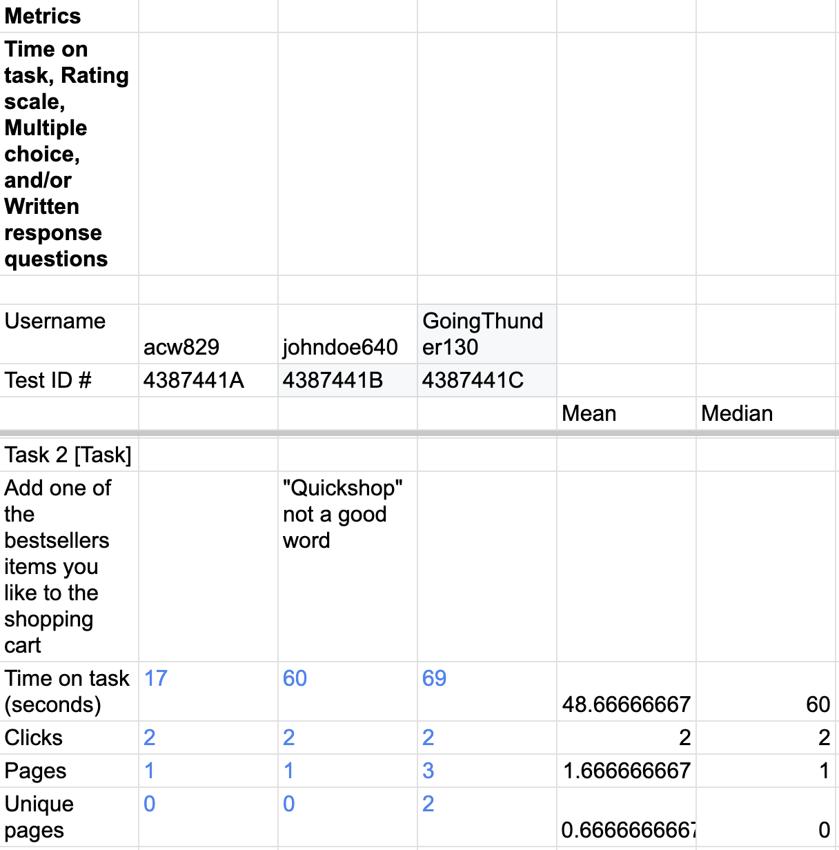
The average time for this task was 61 seconds amongst desktop users. Mobile users averaged 51 seconds. This seems to be a higher discrepancy than expected. If the best sellers were placed the same size on each platform, the time on task would be the same.

Every user was able to complete the task but the difference between time to complete amongst users is important to note. This is supported through verbal responses where users are confused with terminology or don’t know what subsection a product is in.

We found that most users found that best seller products are useful and appropriately placed. This means that best seller product selection is best suitable for most users.

This task averaged the most amount of time. 333 seconds for desktop users and 300 seconds for mobile users. We noticed it was quicker for mobile users and more tailored.
Final Recommendations
Use a homepage image with less action -
Many users found the sparkles in the background image to be distracting and hard to read. Use a tagline image with less action instead.
Make the icons bigger -
One user was not able to find the search bar on the page while it was visible on the page (although very small) and he eventually was not able to successfully find a product by filtering.
Rework product categorization and filtering
Two users were not able to find a product by filtering, although one of them eventually found the product by searching.