NOAA’s GLANSIS Website Redesign

Role: UX/UI Designer
Timeline: Fall 2023 (September 2023 - December 2023), 12 weeks
Skills: Design Thinking, UX Design, Wireframing, Prototyping & Iterative Design, Heuristic Evaluation, Usability Testing
For a UX Design project, I provided a mobile and desktop UI redesign to the National Oceanic and Atmospheric Administration (NOAA). I formulated problem statements, designed for inclusion and diversity through research, and applied UX laws behind my choices.
I applied these skills to create wireframes and conduct usability testing to gain valuable feedback for a clickable prototype that researchers of non-native aquatic species can easily use.
Tools: Figma, Noun Project
Problem
NOAA GLANSIS is a comprehensive resource hub for data on non-native aquatic species in the North American Laurentian Great Lakes area.
Dr. Rochelle Sturtevant, the program manager for NOAA's GLANSIS, offered valuable insights from user feedback on the website.
Numerous sections of the NOAA website lack hierarchy in font sizes, pertinent content, and user-friendly navigation. Given the diverse user group, spanning managers, scientists, and educators, the website needs to necessitate effective presentation of extensive information.
Users voiced frustration regarding readability issues and exporting results within the species list generator, particularly due to scattered information across multiple pages. This results in users needing to undertake multiple steps to accomplish their objectives.
Key Design Decisions
The redesign aims to craft a user-friendly NOAA platform that addresses the varied requirements of stakeholders through unified branding, upgraded search features, enhanced aesthetics, and a more intuitive design.
Quick Species Search Feature
Offering a feature that is upfront and takes less time to find.
Species List Generator
Implementing an intuitive and readable filter system with distinct rounded corners corresponding to different input formats.
Search Results Page
Introducing additional elements to enhance user navigation within the website
Grouping items into manageable chunks to reduce cognitive strain
Species Profile Page
Reducing cognitive overload by increasing the text size and reducing the amount of information the user initially sees.
GLANSIS Data Dictionary
Reorganizing buttons and changing iconography to meet modern design standards and allow users to feel at ease with more whitespace.
Design Decision #1
Quick Species Search Feature
Users who have utilized the Quick Search functionality express dissatisfaction primarily due to uncertainty regarding its purpose. Moreover, users are discontent with the need to navigate through 3-4 links to access a species profile. The current layout positions the Quick Species Search in a confined corner of the website, resulting in an awkward whitespace above the introduction.

Before

After (Desktop View)
In the redesign, the Quick Species search is offered at the top and center of the screen, allowing experienced users to reduce clicks and get to a specific profile intuitively. For newer users, they can explore the options below and use the main Species List Generator button.
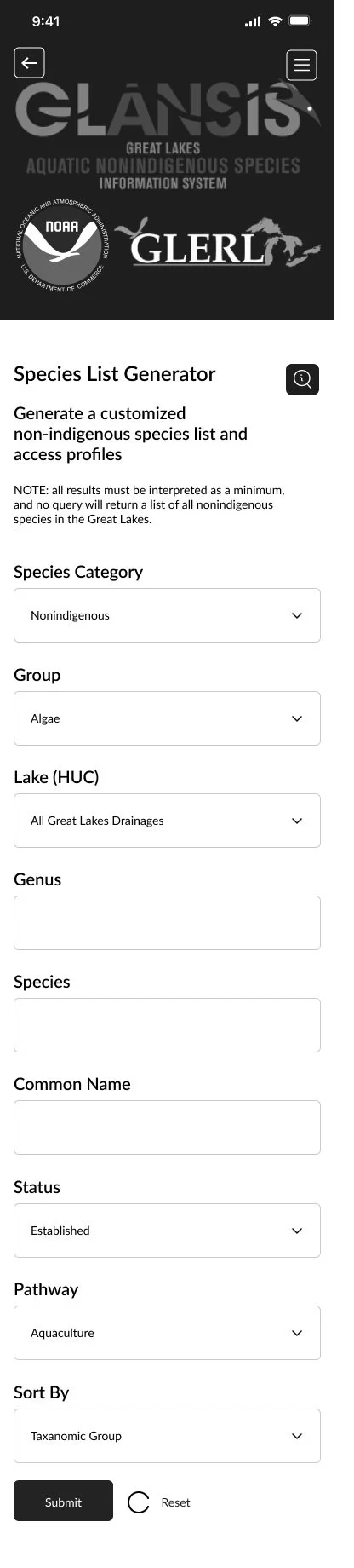
Design Decision #2
Species List Generator
The Species List Generator offers numerous filtering options, often confusing users who are not familiar with the tool. Rochelle noted that approximately 90% of users simply wish to access the species profile directly. Furthermore, many users who utilize this feature are only interested in determining the number of species post-filtering.

Before
After (Mobile View)
In the original design, users were tasked with inputting details like genus, species, and common name, potentially prolonging decision-making time (as per Hick’s Law). My redesign simplifies this process ensuring the text is more readable to all users and that each input section is clearly distinguished from the other.
Upon filtering, users can readily view the results displayed by clicking the "Submit" button.
Navigation
The goal of the mobile interface was to use features that users are familiar with. Jakob’s Law emphasizes how users spend their time on other websites so it’s important for users to utilize recognition rather than recall to proceed to a new page. The redesign allows for easy error prevention through a back button and navigation.
Users are familiar with a hamburger interaction where the top right of the mobile screen opens up a navigation menu. This redesign opens up key choices and allows users to easily close the menu by pressing the ‘X’ button. For desktops, it’s similar to other sites as well where all page buttons are located at the top. By keeping the navigation at the top, you are reducing the time it takes for users to go to a certain page, adhering to Fitt’s Law.

‘X’ Button in the Top Right of Navigation

‘Back’ Button in the Top Left
Design Decision #3
Search Results Page
On the original website, certain search outcomes were excessively lengthy, necessitating prolonged scrolling for users to locate their desired species. Rochelle noted the ineffectiveness of the "sort" button, intended for users to arrange selections upon reaching them. Furthermore, this page violates the User Control and Freedom usability principle by failing to provide users with a means to return to the search results page after selecting a species profile.

Before
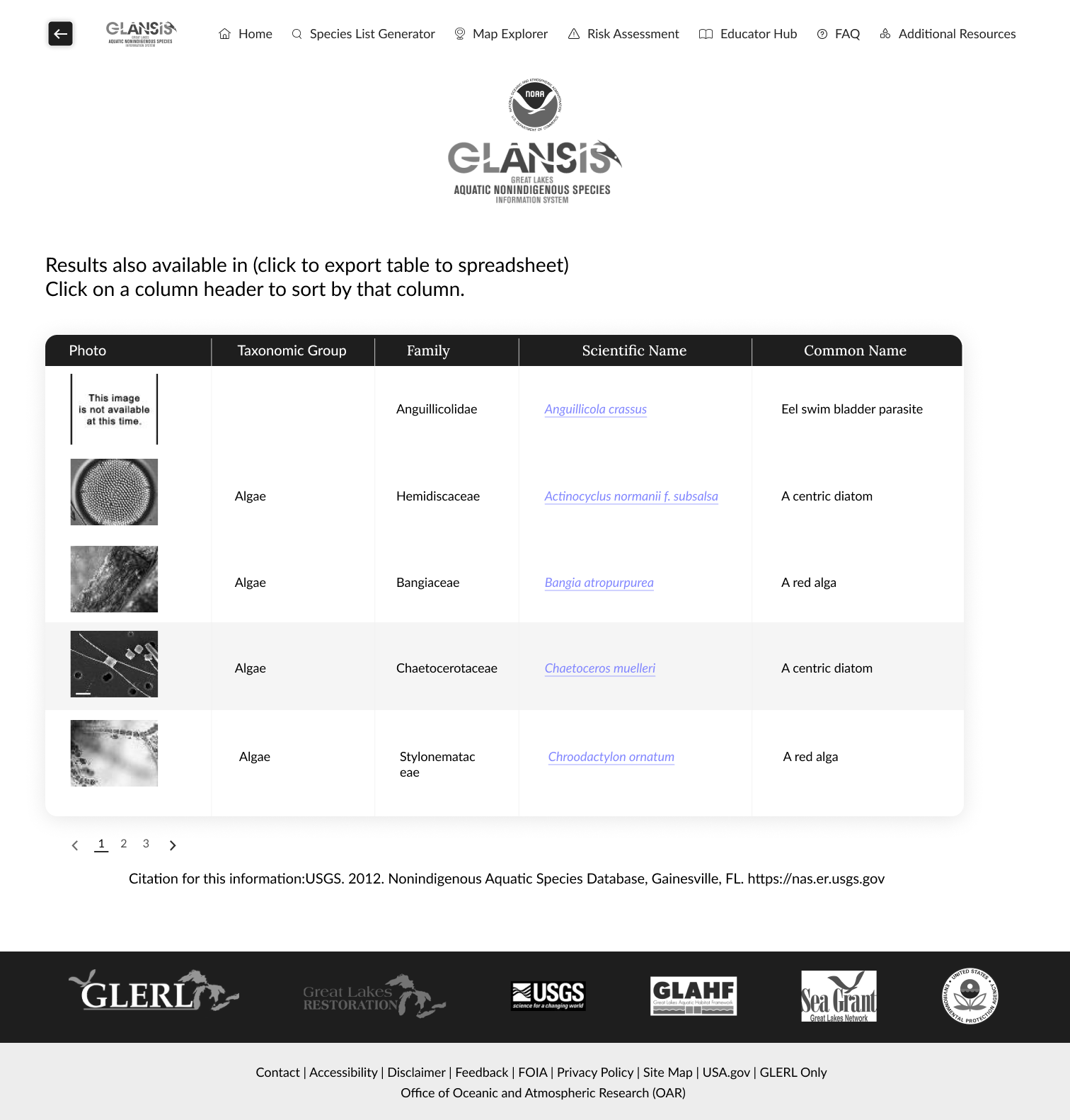
After (Desktop View)
Responsive design helps save the Results Page.
Responsive design is an approach to web design that ensures a seamless and optimal user experience across various devices and screen sizes. The goal is to adapt the layout, content, and functionality of a website or application to provide a consistent and visually appealing interaction, regardless of whether users access it on a desktop, tablet, or mobile device. Mobile was the main prototype and then the desktop was created with larger images and text to enhance readability. The desktop has an exclusive page numbering design to allow for a condensed search results page which is more aesthetic and cohesive. Likewise, the back button from the mobile redesign moves over to the desktop redesign in case the user doesn’t like the presented results page.
Design Decision #4
Species Profile Page
Users conveyed their frustration with the species profile page. The presentation of all information on a single page leads to information overload, overwhelming users. Moreover, the arrangement of information lacks intuitiveness, as some users seek specific details about the species.
The redesign increases the size of text, icons, and clickable areas to meet Minimum Touch Target Recommendations according to the Laws of UX. This ensures that the ‘right’ amount of information is on one screen. Icons were kept consistent as well:
Iconography
Icons serve as efficient and universally understood tools for conveying information, reducing reliance on textual instructions. Consistency in style enhances the visual appeal of the interface and reinforces a sense of cohesiveness. Examples show a simple selection of icons through Lucide Icons that is simple and easy to understand for all users.

Design Decision #4
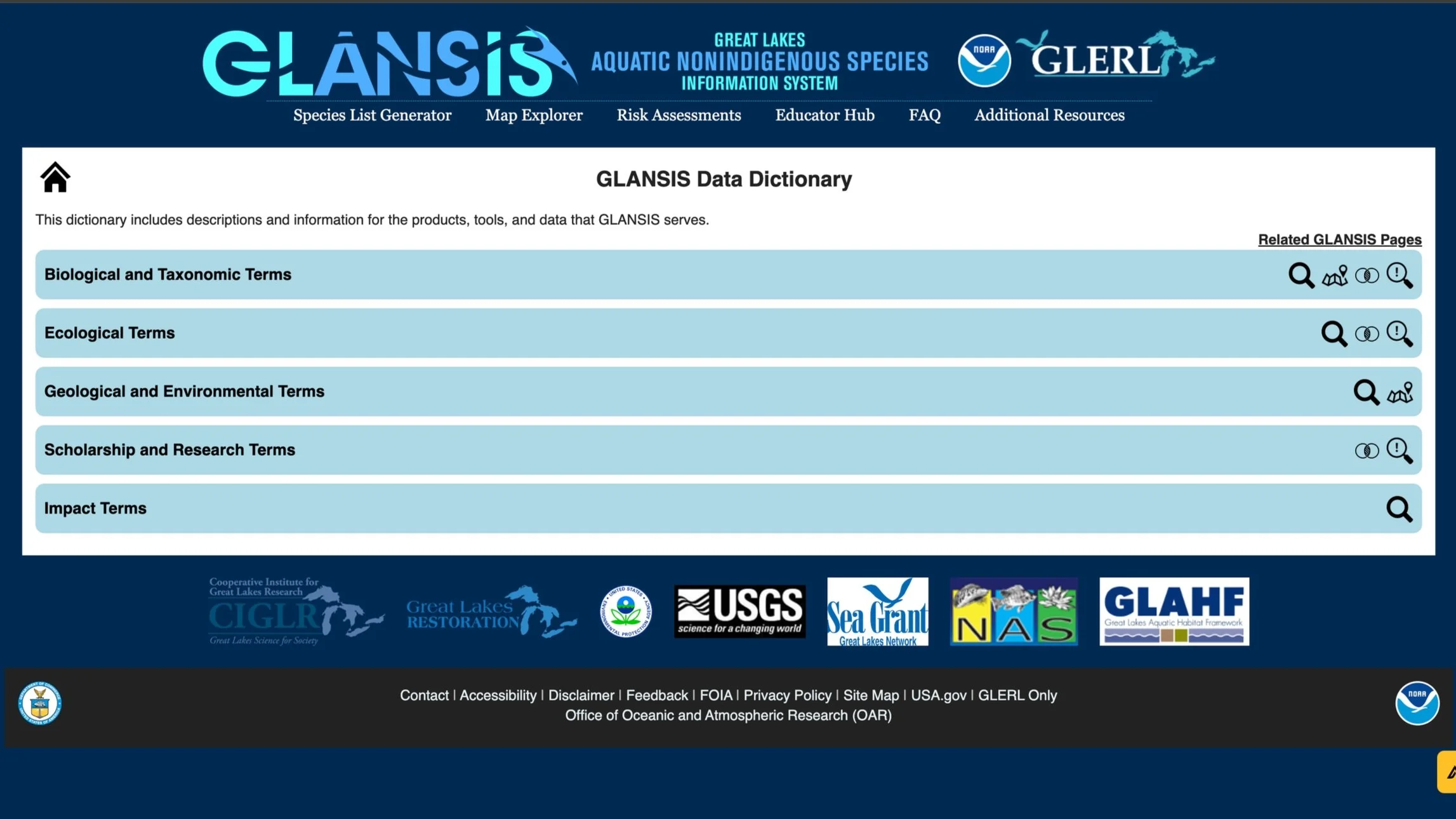
GLANSIS Data Dictionary
The data dictionary includes descriptions and information for the products, tools, and data that GLANSIS serves. The current page groups terms by name through a drop-down feature: Biological, Ecological, Scholarship, etc. After a user clicks on Biological Terms, there is too much information that expands. The redesign implements “Read More” buttons to reduce a text-heavy page. Drop-down arrows are also implemented to show the status of the button/system, letting users know that something is clickable.
Before

After (Desktop)
The Final Screens
Mobile View
Desktop View
Created with Figma
Reflection
What I Learned
I expanded my knowledge about problem formulation, user needs, usability testing, and UX Laws. I learned common interaction implementations like adding drop-down menus and hamburger navigation.
Iterate as much as possible. I didn’t know what approach to take when coming up with a solution for NOAA. It would have been best to sketch on paper before going into wireframing. Starting on a design tool like Figma forces existing designs to stay because they can be difficult to change.
Ask for feedback from the experts. There are always designers who have more experience with design tools. It is beneficial to conduct your research when trying to figure out how to design a certain interaction like the lines that appear under each navigation button upon clicking. I wish I had asked my peers for help so I could focus on the overall layout of the wireframes to meet the recommended design standards.