FitSync

Role: UX Designer, UX Researcher
Team: Abir Ahmed, Alex Jacobs, Chris Sayah, and Lindsay Nelson
Timeline: August - December 2023, 15 Weeks
Skills: Competitive Analysis, User Interviews, Usability Testing, Sketching, Persona Creation, Storyboarding, User Flow Modeling, Low-Fidelity and High-Fidelity Prototyping, Project Management
For an Interaction Design project, my team partook in the UX process to design an all-in-one fitness app that enhances progress tracking and enables personalized customization through AI and real-life coaches.
We were drawn by how the youth have advanced technology in the palm of their hands, but don’t use it for everyday tasks like running.
Tools: Figma, FigJam, Miro
The Prompt
Design a product that contributes to one (or several) of the 17 UN Sustainable Development goals. The product should feature 15 - 30 interactions, and the target audience should NOT be college students.
The Solution
FitSync, all-in-one fitness app, that enhances progress tracking and enables personalized customization through AI and real coaching.
Defining the Problem
After a card-sorting activity, we focused on Good Health and Well-Being. This started with all members having used fitness apps/devices to some degree but later deleted them because of a lack of personalization and the interfaces being unintuitive. Eventually, our problem statement was formed…
Young people who use fitness applications are unmotivated, plateau in their fitness progress, and have trouble tracking their goals over time.
What are design opportunities that provide users with the most optimal, personalized strategy to meet their fitness goals?
Competitive Analysis
Shift in our approach
We conducted a competitive analysis to narrow down what our solution needed. We initially focused on applications that use genetics to formulate personalized recommendations. We realized this was not cost-effective and decided to focus on features that were mostly digital.

User Interviews
A total of 8 interviews were conducted to discern user sentiments around physical fitness and their fitness journey. Themes were extracted from the interviews.
Lack of Motivation
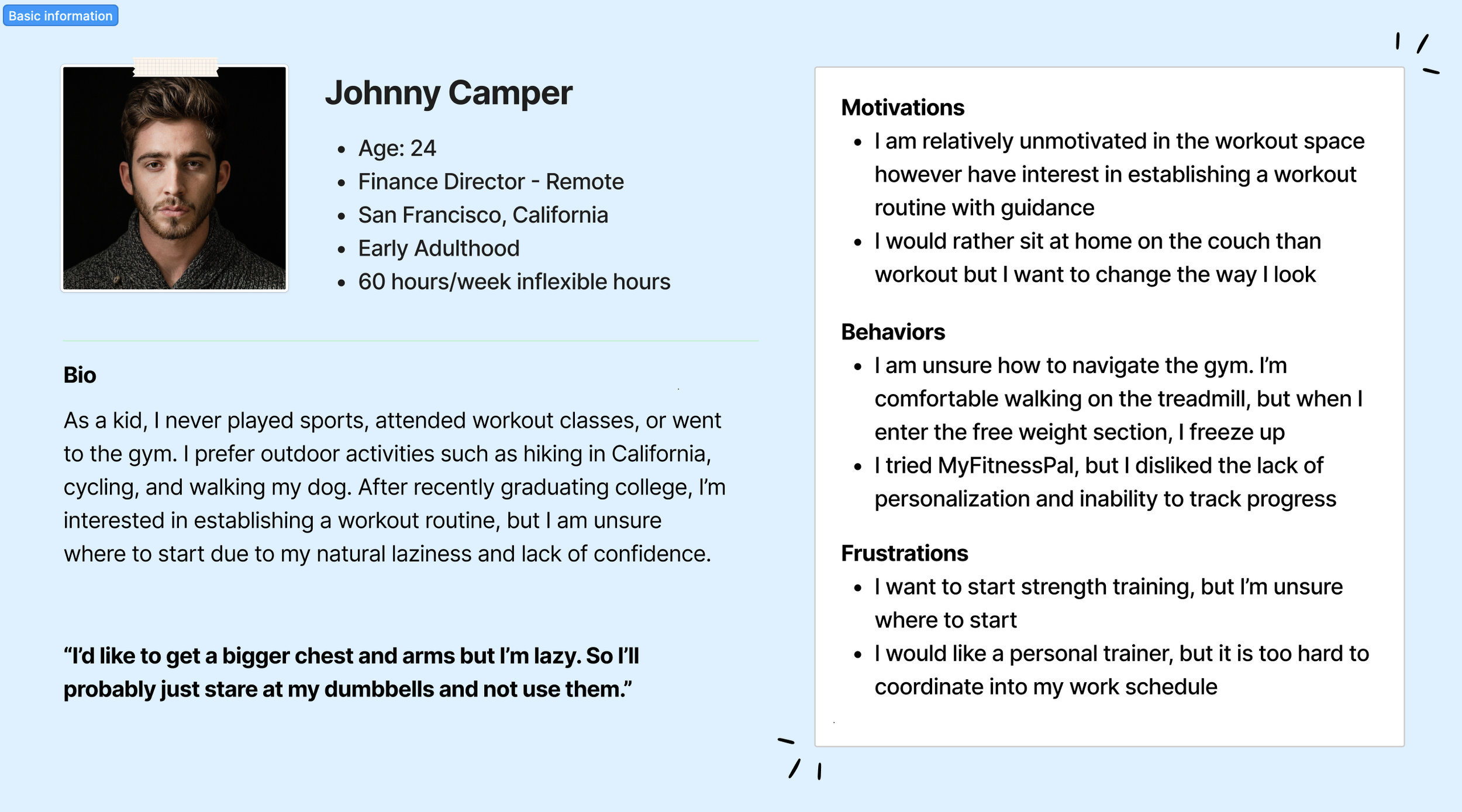
“I’d like to get a bigger chest and arms but I’m lazy. So I’ll probably just stare at my dumbbells and not use them.”
Inability to Track Progress
“Previous fitness apps weren’t used because they seemed like a chore and therefore I heavily relied on SmartWatches for a seamless user experience.”
Lack of Coach Guidance
“Fitness apps should increase abilities to track my progress, suggest
new workouts, dietary help, interactive capabilities, and AI like ChatGPT.”
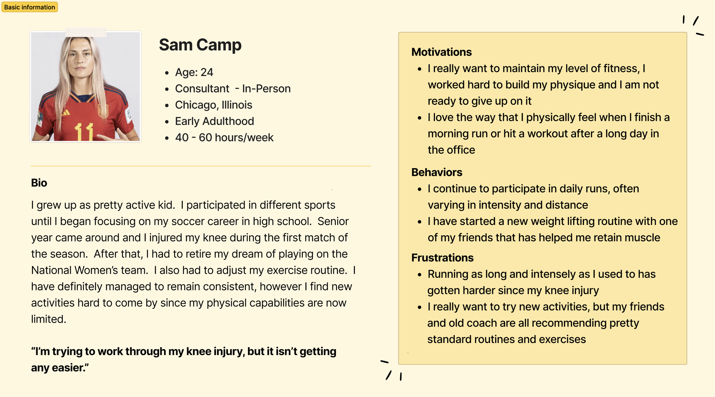
Personas, Sketches, and Storyboards
Workout Routine Intensity vs. Fitness App Usage
We used coded interview data to formulate 3 personas that represent our target audience. We needed to account for different activity levels and different fitness technology usage levels.

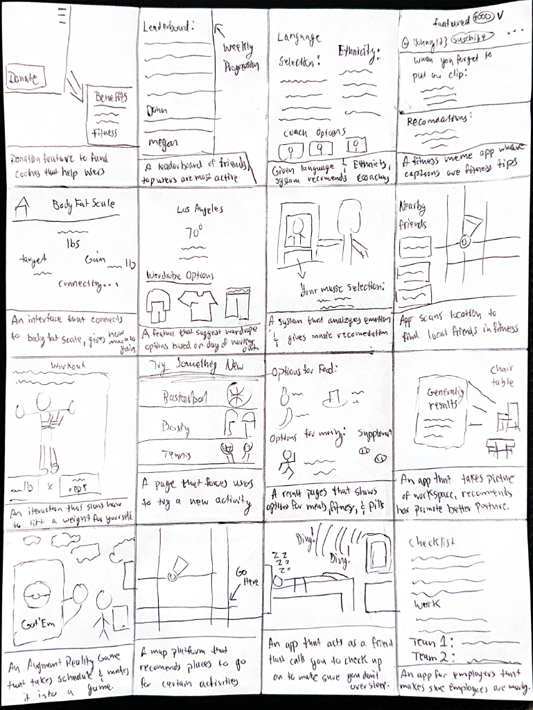
Sketches and Storyboards
32 individual solution sketches were brainstormed alongside 3 scenarios/storyboards, illustrating how different personas deal with issues with fitness apps. Some users had a regular fitness routine and some didn’t, allowing us to build empathy and design around them.


User Flow Diagram
We created a user flow diagram to show various pages and interactions such as creating a profile, accessing workout history, tracking workouts through Bluetooth, and accessing coaching recommendation pages.
Low Fidelity to High Fidelity Prototypes
Low Fidelity Prototype

Low-Fidelity Usability Testing
Each team member conducted 1 usability test with 5 tasks for users to complete. Below is a sample task:
Task: Users were prompted to attempt to talk to a coach through a chat function for workout advice.
Issue: Users could not identify that the navigation bar icon signified a chatbot feature.
Recommendations: Change the icon to a typical chat icon to better align with the user’s expectations.

Navigation
High-Fidelity Prototype (FitSync 1.0)
The first version of FitSync is born. Moving from wireframes to higher fidelity, users can see main features like scheduling a meeting with a coach.
High-Fidelity Usability Testing
Each team member conducted 1 usability test with 5 tasks for users for the hi-fi prototype. It became clear that users wanted more coaching options. Below is a sample task:
Task: Users were prompted to schedule a meeting time with a coach.
Issue: Users had issues with finding the calendar page. They thought that the “+” in the nav bar was used for scheduling.
Recommendations: Potentially change icons to fit the respective task. Make pop-ups more visible.
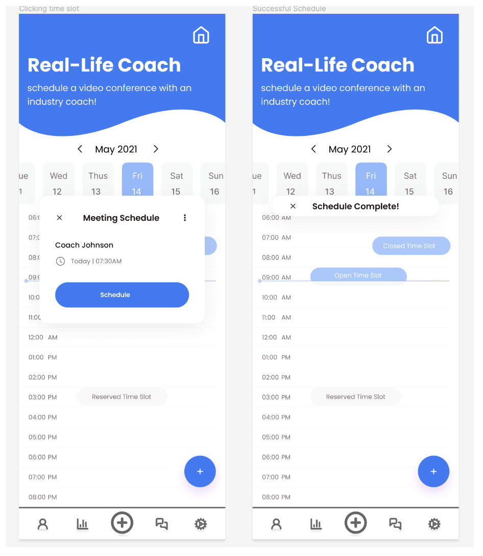
Real-Life Coach Scheduling
The Final Screens

FitSync prompts users to pair their device with exercise machines through Bluetooth, so repetitions can be easily and automatically tracked and logged. Hick’s Law states that the more options are available to a person, the longer it will take for him or her to make a decision about which option is best. The main buttons were limited and close to the thumb for easy access.

We wanted to allow users to connect with AI or a real-life coach for personalized workout advice. Jakob’s Law states that users spend most of their time on other sites. This means that users prefer sites that work the same way as all the other sites they already know. The scheduling system was kept similar to competitors like MyFitnessPal and chatbots like ChatGPT, where the user is presented with a group of options first.

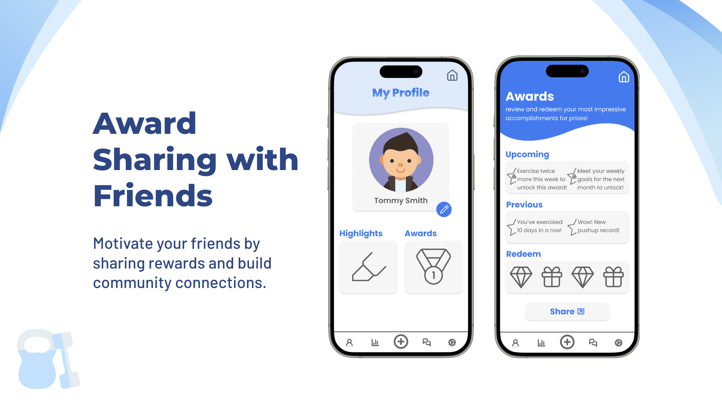
To motivate younger people that find difficulty with getting active, there’s now an award sharing system.
Mobile View
Created with Figma
FitSync Final Prototype Video
Link to full Figma work file here.
Reflection
Impact
We hope that FitSync brings a new aspect to the fitness space: personalization. As fitness is all about the self, we feel as though competitors lack the personalized touch that our app embodies. Each individual has a unique, individualized fitness journey, no matter the motivation. Therefore, each individual deserves a mobile experience that facilitates just that: a workout experience that is solely for you and your needs. Finally, FitSync highly motivates users with awards to inspire healthy and friendly competition.
Takeaways
It’s essential to constantly question yourself how your end solution relates to the initial problem space and user needs you initially identified. When developing features, we got stuck brainstorming use-case scenarios that didn’t even relate to our problem statement.
Learning from other designers, disregarding experience levels, is extremely helpful. There is always something new you can learn from others and room to improve your designs.
Learning from users is just as helpful as learning from experts. They provide insights that can be obvious and may be missed by designers.
What Would I Do Differently?
Spend more time developing the high-fidelity prototype together as a team and further develop the style guide. In the essence of time, we delegated specific screens to individual team members, which led to inconsistent UI and lots of work afterward specifying margins, spacing, and details that could have easily been discussed upfront.
Ask for feedback throughout the entire design process. Initially, I envisioned myself presenting a “perfect” UI in our first high-fidelity draft prototype. I quickly learned that immediately fixating on small graphical elements can distract you from prioritizing the information architecture and overall flow of your app for users.