Improving U-M Campus Navigation
Role: Lead UX Researcher
Team: Abir Ahmed, Bobby Housel, Neha Kotagiri, Emily You
Timeline: Fall 2022 (October 2022 - November 2022), 8 weeks
Skills: UX Research, User Interviews, Affinity Mapping, Survey Design, Personas, Storyboarding, Visualizations, User Journey Mapping
For a Needs Assessment and Usability Evaluation project, our team partook in the Double Diamond Design Process to provide suggestions for the University of Michigan’s campus wayfinding app by analyzing difficulties that students face when navigating around campus.
Tools: Google Workspace, Microsoft Suite, Miro, Otter, Canva
Research Question
What are the biggest challenges that students face in finding what they need (e.g., classes, services, food) on campus?
The University of Michigan wants to create a campus wayfinding app to help students navigate and get to what they need. With this project, we are looking to find the main difficulties that students face when getting what they need.
Solution
Individual classroom codes are difficult to find.
The biggest challenge for students is finding individual classrooms within campus buildings given a building code or acronym more than getting to the buildings themselves.
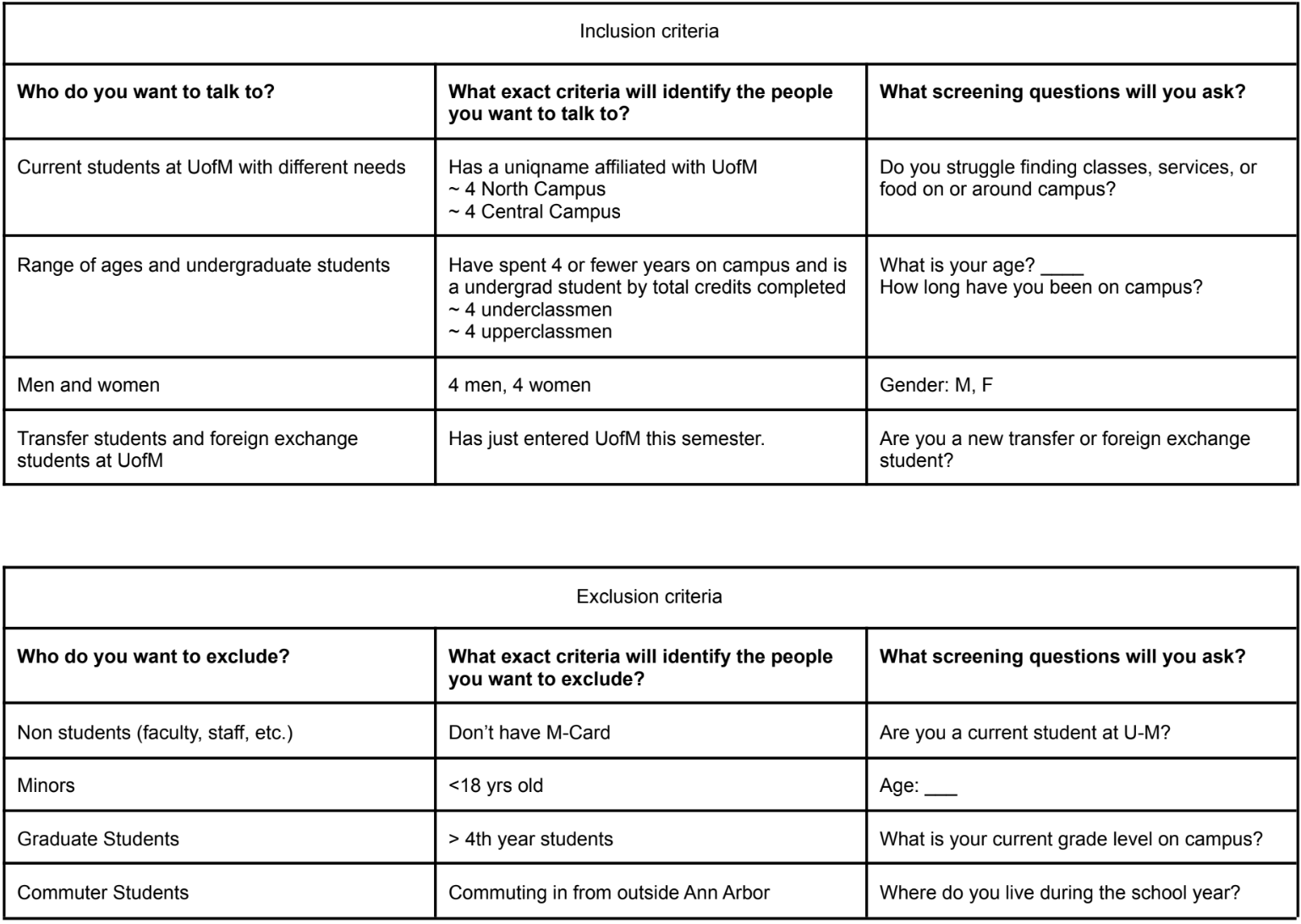
Inclusion & Exclusion Criteria
Inclusion:
Current students at UofM with varying navigational needs
Range of underclassmen ages
Men and Women
Transfer students / Exchange Students
Exclusion:
Nonstudents
Minors (under 18)
Upperclassmen
Commuter students
To narrow down the target audience that best associates with the research question, we defined inclusion and exclusion criteria that would guide us through recruiting, interview question development, and research deliverable creation.
Interview Guide
A contextual inquiry was conducted before using the interview guide.
This required students to walk the researchers through the process of going to a certain location on or near campus while the researcher asked them questions about the process.
Spradley’s 5 Types of Descriptive Questions—grand tour, mini-tour, example, experience, and native-language questions—were used to structure the questions.
Interview Guide Structure:
Introduction: purpose of study, informed consent process, and permission to record
Warm Up Questions:
What do you study? How have your classes been going?
General Issue Questions:
Do you use anything while walking around campus to navigate?
“Deep Focus” Question:
Could you describe what goes on during a particular class day on campus?
Retrospective:
What role did technology play in your experience? Did it make the process easier?
Wrap-Up: Discuss the benefits of participants to study, additional questions and concerns, and contact information.
User Interviews
8 interviews were recorded, transcribed, and coded.
Collection of User Interview P1 - P8
To code the interviews, we used comments starting with “I” statements to show important points as it relate to the research question from the perspective of the target audience.
Affinity Mapping
Students have the most difficulty finding specific rooms inside buildings.
Highlighted codes from the interviews were transferred to a Miro board to better understand and organize the research findings.
Other Findings:
Students like to walk as opposed to public transport because walking is simple.
Students go to places more often if they know local landmarks or if friends live nearby.
Navigation tools like Apple Maps are most preferred for simplicity.
Bus routes are difficult to between North and Central Campus
Data & Outcomes
Survey Design
17 responses were gathered through a survey and four visualizations were created to reflect our analysis of the data and to reaffirm discoveries from the interviews.
One visualization compared data regarding frequency of use with each major navigational tool. This was created alongside responses to the below survey question as it relates to navigation services. The data determines that Apple Maps received the most use alongside Campus / Street Signs. This reassured how simplicity is favored and the appearance of signs is very important when navigating around campus.
Using this data, we wanted to design an app with importance, simplicity and efficiency.
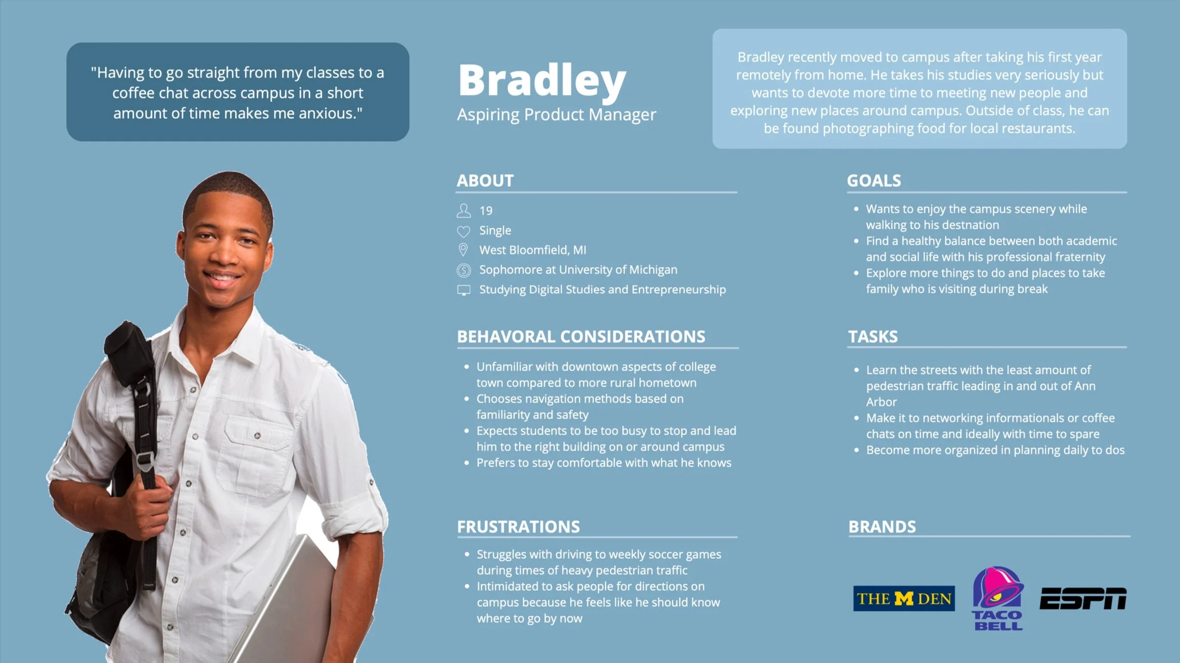
User Personas
Two ideal persona types were crafted using Canva. These personas would most likely use the campus wayfinding app and represent the target audience as previously determined.
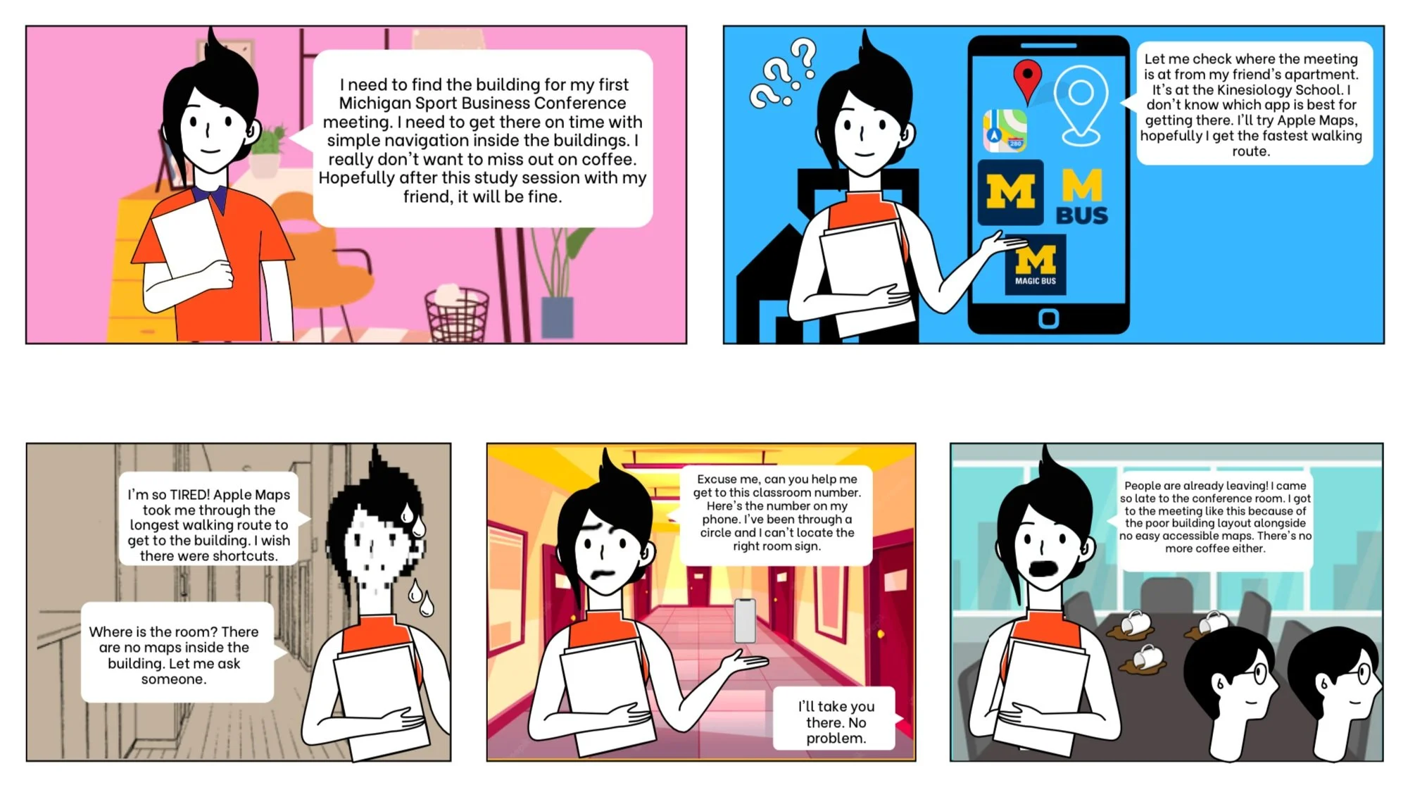
Storyboard
We created a storyboard describing the current process of one of the personas using a navigational app to attend their first club meeting alongside the difficulties that come from it.
Task Analysis Diagram
The task analysis diagram breaks down the current steps needed to get to a Starbucks from North Campus to Central Campus. Subtasks categorize bigger tasks into small tasks for simple decision-making.
Reflection
What I Learned
Close friends are not the best participants even if they fit the criteria: It is very convenient to get close friends in a research study. You get to know the participant more and can ask questions that you would not be able to ask other participants. This is also very difficult for the project as it creates some bias that needs to be addressed to make the findings more credible.
Switch between facilitator and interviewer often: It’s important to gather notes as a facilitator which then can be better presented as you are an interviewer. Being in both positions allows the researchers to determine bias that could occur which can then be alleviated in the future.
Next Steps
Move to the Define stage in the Double Diamond Model of the Design Process: narrow the problem scope and brainstorm a concrete problem statement.
Begin wireframing potential designs to create a seamless and familiar user experience for the Maps page of the University of Michigan mobile app, utilizing competitors as inspiration.


